Real Estate Data Visualizations of the Week - Oct 16
Our favorite real estate charts and data visualizations for the week.
This week we saw new data for housing activity and the bifurcation of the housing market. Here are our favorite charts and data visualizations regarding real estate:
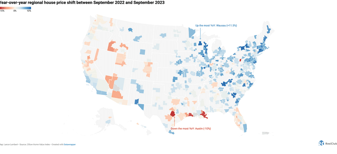
The bifurcation of the housing market. A fantastic interactive map from Lance Lambert.
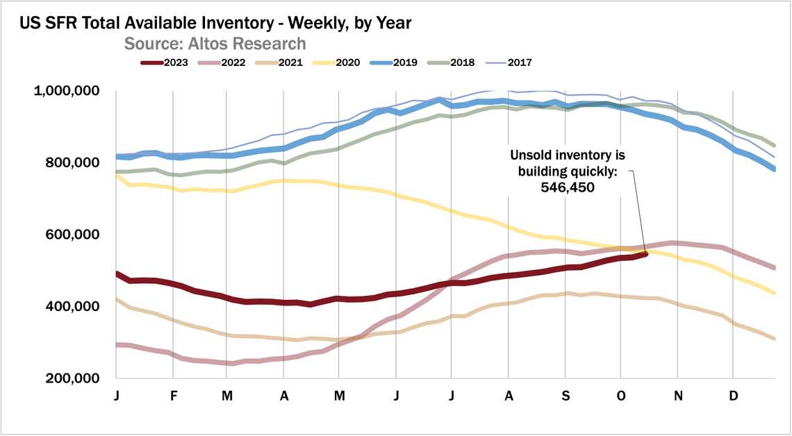
Housing Inventory Quickly Building. A great new report on the health of the market by the folks at Altos Research.
The Atlanta Alarm? Large SFR operators own up to 1/10 homes in Atlanta - national average is 0.7%. Created by Parcl Labs.
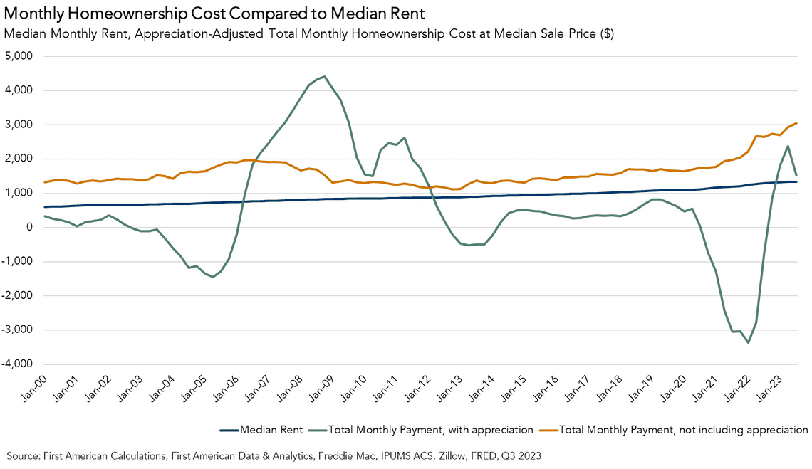
The cost of owning Vs renting a home? Interesting approach by Odeta Kushi.
Daily consumer spend tracker, with Chase card data. Created by Parker Ross.
Roads of Great Britain! ll roads from highways down to dirt tracks. Stunning visualization from Python Maps.
- Stew Langille
- @slangille


